Samiksha Gharote

BACKGROUND
Tail it Easy is a platform for pet owners where they could get fresh meals and treats delivered to their doorstep and also book services for all their pet’s needs. I was in charge of designing and testing experiences for the iOS, and Android applications and a website. This enabled me to work closely with the founders on the concept and research and with the developers on wireframes, user flows and prototypes. We were a small team and iterated quickly over multiple design decisions.
HIGH-LEVEL TIMELINE
July 2018- April 2021
MAKE OF THE TEAM
3 software developers, Product Manager, Product Engineer, Visual designer, Growth marketer
MY ROLE
UX design, User research,
Visual design
NEED AND OPPORTUNITY
The Pet care market in India is expected to grow at 15% annually to become a $1,356 million market by 2025. The Pet food market alone is projected to cross $434 million. Seeing this potential, what initially started as an adoption platform, was navigated towards becoming a platform for a food delivery platform. Pet care services are also an untapped market and in the second phase, the platform focused on being a marketplace aggregator for pet boarding centres.
PROCESS
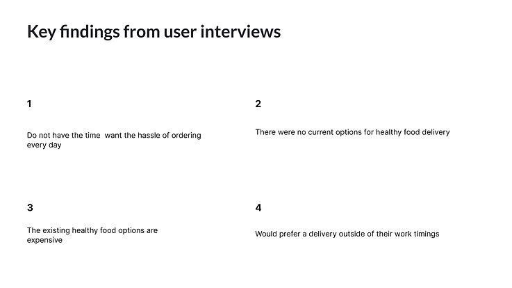
INSIGHTS FROM USER INTERVIEWS
A few of the existing users of the app along with other pet owners were interviewed to understand their current habits and preferences, their thoughts about a potential food delivery service and what will help them achieve a better diet for their pet.
CONCEPT & SOLUTION

DESIGN
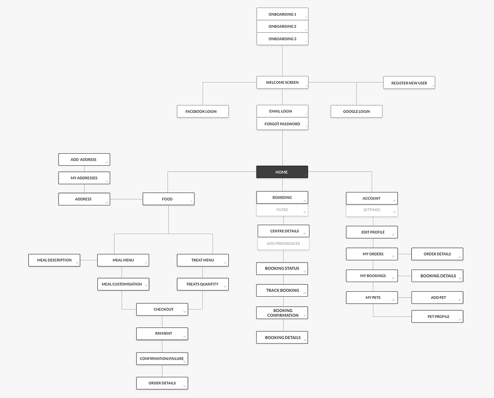
INFORMATION ARCHITECTURE
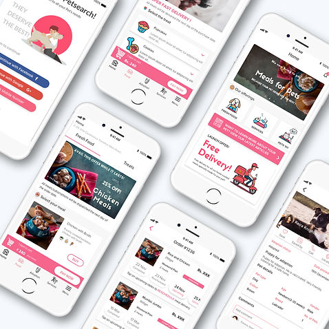
MVP
The initial design for the MVP was created using the existing design language of the application to quickly test the idea and app with existing and potential users of the app.
USER TESTING
User testing helped us understand that a lot of dynamic changing prices at the bottom sheet of the food app were confusing for most of the users. The app was redesigned for static pricing for each type of meal subscription.

USER FEEDBACK AFTER IMPLEMENTATION
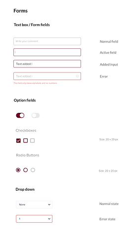
A Design style guide was created to solve the problem of inconsistent UI design to be in line with the rebranding of the company. This was done to ensure that the designers and developers followed the same guidelines while creating the products.
-
User feedback helped us understand that a lot of users missed the reschedule button and had to connect with us to understand the reschedule options.
-
We asked our users for the reason for the drop-offs at checkout and realised the main reason was the choose date option at checkout which they missed and which stopped them from moving to the payment stage.

WORKSHOP AND AREAS TO REFINE

A Design style guide was created to solve the problem of inconsistent UI design to be in line with the rebranding of the company. This was done to ensure that the designers and developers followed the same guidelines while creating the products.
🧭
Improve navigation in the order flow
📱
Consistent UI design in line with new branding
🤳
Add-ons to improve the UX
🤳
Changes to existing UI based on user feedback
DESIGN GUIDE
A Design style guide was created to solve the problem of inconsistent UI design to be in line with the rebranding of the company. This was done to ensure that the designers and developers followed the same guidelines while creating the products.


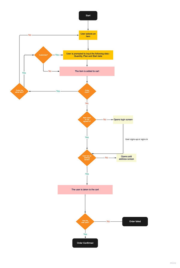
MODIFIED USER FLOW
A Design style guide was created to solve the problem of inconsistent UI design to be in line with the rebranding of the company. This was done to ensure that the designers and developers followed the same guidelines while creating the products.
REDESIGN BASED ON USER FEEDBACK
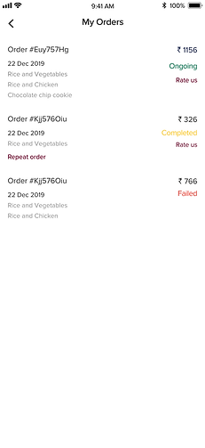
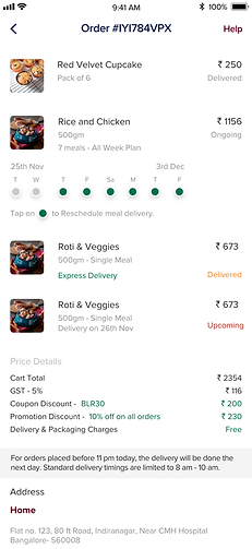
Reschedule and repeat the last order
The reschedule option was redesigned to provide more clarity and a repeat order option was added for frequent customers.
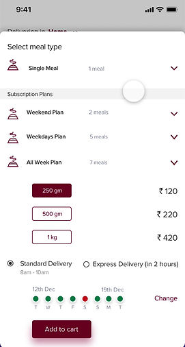
Express delivery and repeating customisations
Express delivery option was added for customers who required deliveries within 2 hours for a single meal. This flow shows the way the user can repeat customisations and delete items in the case of multiple plans for the same meal.
.png)
BOOKINGS
The second phase of the app was a marketplace aggregator platform of pet boarding services. The service providers were interviewed to understand their needs and ease the process of booking for the users.
FOCUS AREAS AND PROBLEMS
🧭
The service providers required a trial session before the actual booking dates
📱
Users to be notified about the booking status and information at each stage
🤳
Easy payment and booking through the app
USER FLOW


USE CASE OF THE TRIAL REQUESTED BY THE SERVICE PROVIDERS
After selecting the boarding centre the user will be informed that the centre requires a prior visit and they would be prompted to select a date for the prior visit.
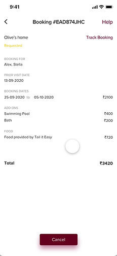
DIFFERENT STATES FOR THE BOOKING
This prototype shows a basic flow of the booking process after a request has been made to the service provide till the confirmation of the booking.
DIFFERENT STATES FOR THE BOOKING
This prototype shows a basic flow of the booking process after a request has been made to the service provide till the confirmation of the booking.